Tidy Tuesday for week 50 of 2019 was inspired by this blog post by Rafael Irizarry on replicating plots in R.
I focused on a heatmap showing infectious diseases in the United States before and after the introduction of vaccines.
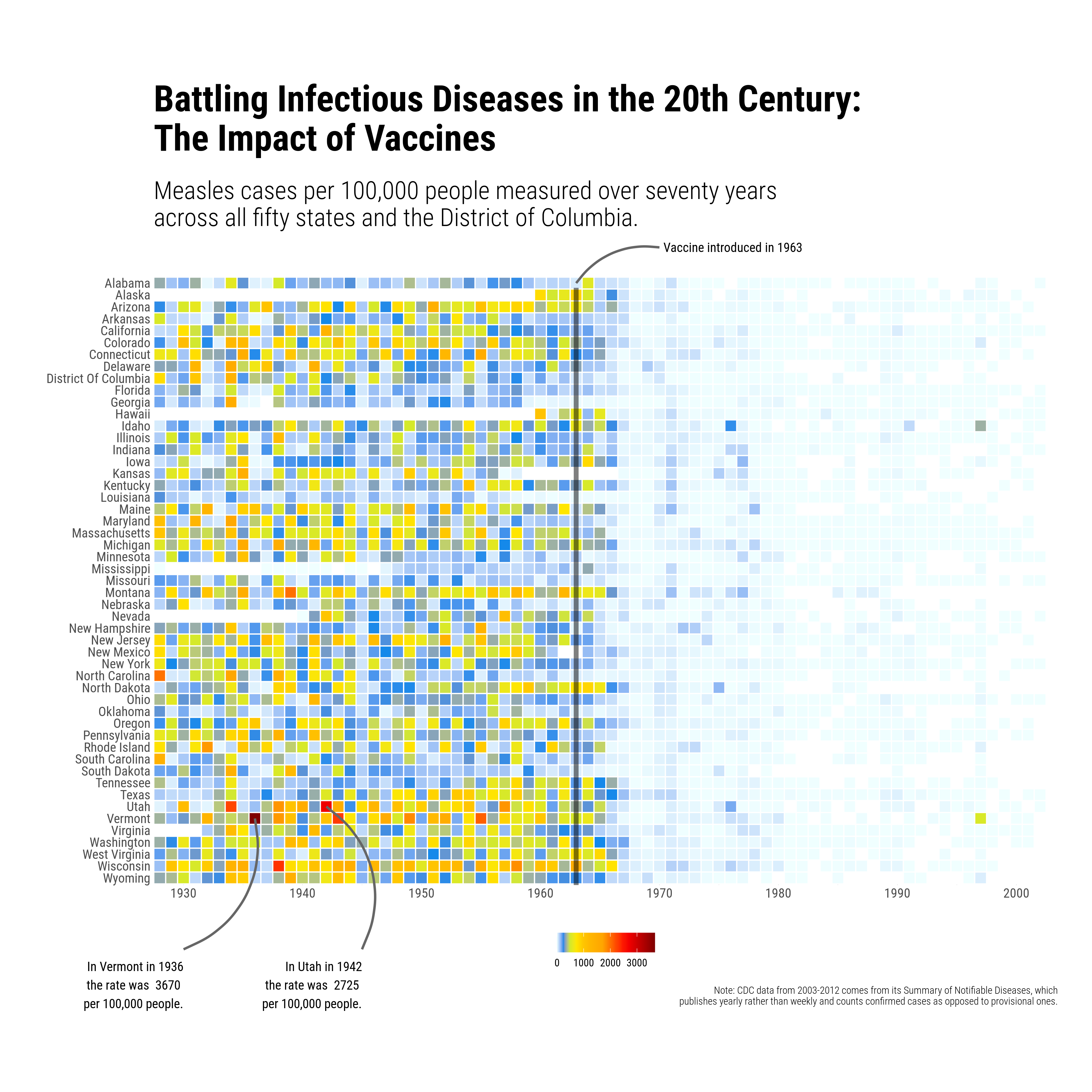
My plot is heavily based on Rafael’s code with just a few extra annotations and a change of scale to match the original version published in the Wall Street Journal.
This was my first attempt at adding annotations outside of the main plotting area. I learned how to create annotations for this plot from the work of Georgios Karamanis. In particular, his week 36 entry for 2021.
Code here: https://github.com/MHenderson/replicating-plots-in-r